Design System Mobile Tables
Overview
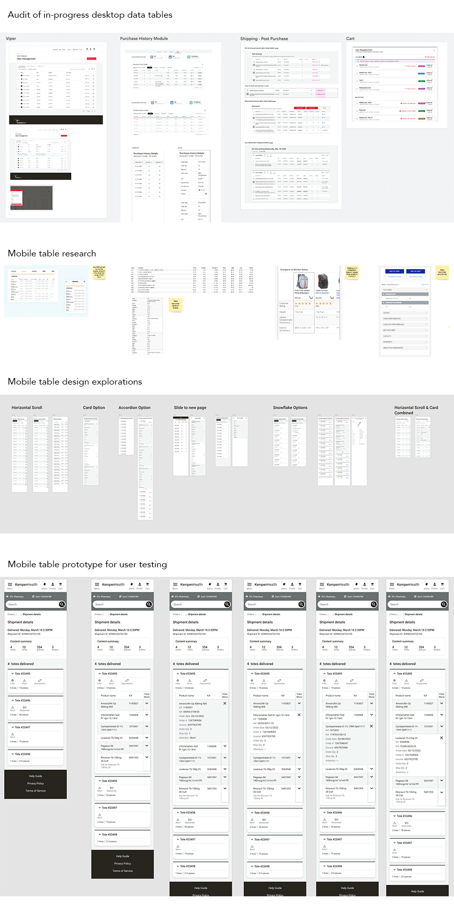
Our e-commerce platform is very data-heavy. Initial research found that our users want access to all the information so they can make the most informed decision before ordering. Tables condense a large amount of information in one area and are useful for comparing many items quickly and easily. Knowing this, the UX Team wanted to get started with mobile tables sooner, rather than later.
The Problem
Data-heavy tables on mobile screens are notoriously difficult. How do we show so much data on small screens?
My Hypothesis
Develop a mobile table component for the Design System. A component that can flex based on data needs helps the UX Team work faster and create a cohesive experience for our users.
Discovery
- Audit tables used on the current e-commerce platform
- Audit tables currently in production with the UX Team
- Research existing applications of mobile tables
Exploration
- Filter down the information shown to only the most important? What is the most important data to users?
- Take the data out of a table and use cards instead?
- Comparison feature? Is it feasible for MVP?
- Accordion? Critical information on view and the rest accessible on expansion of the accordion.
Feedback
After my discovery and exploration on mobile tables, I presented to the greater UX Team for feedback and to discuss feasibility with our Developers.
After several iterations on a combined horizontal scroll and card concept, we determined it would be best to do a usability study.