Design System Notification Styles & Usage Guidelines
Overview
A third party assisted our team in developing a Design System for our e-commerce platform. When they rolled off the project, our UX team was left with a lot of components but no direction on how and when to use them.
The Problem
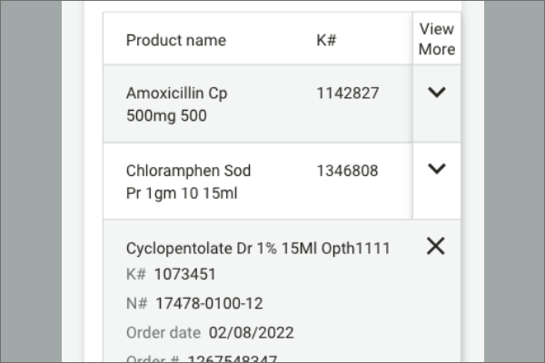
UX Designers were confused on what notification components to use and when to use them creating a lot of swirl amongst the team and slowing down productivity. With a lack of direction, notifications were used slightly different throughout the site creating a very inconsistent experience for our users.
My Hypothesis
Defined rules on how and when to use notifications would help the UX team work faster and create a consistent user experience across the product.
Execution
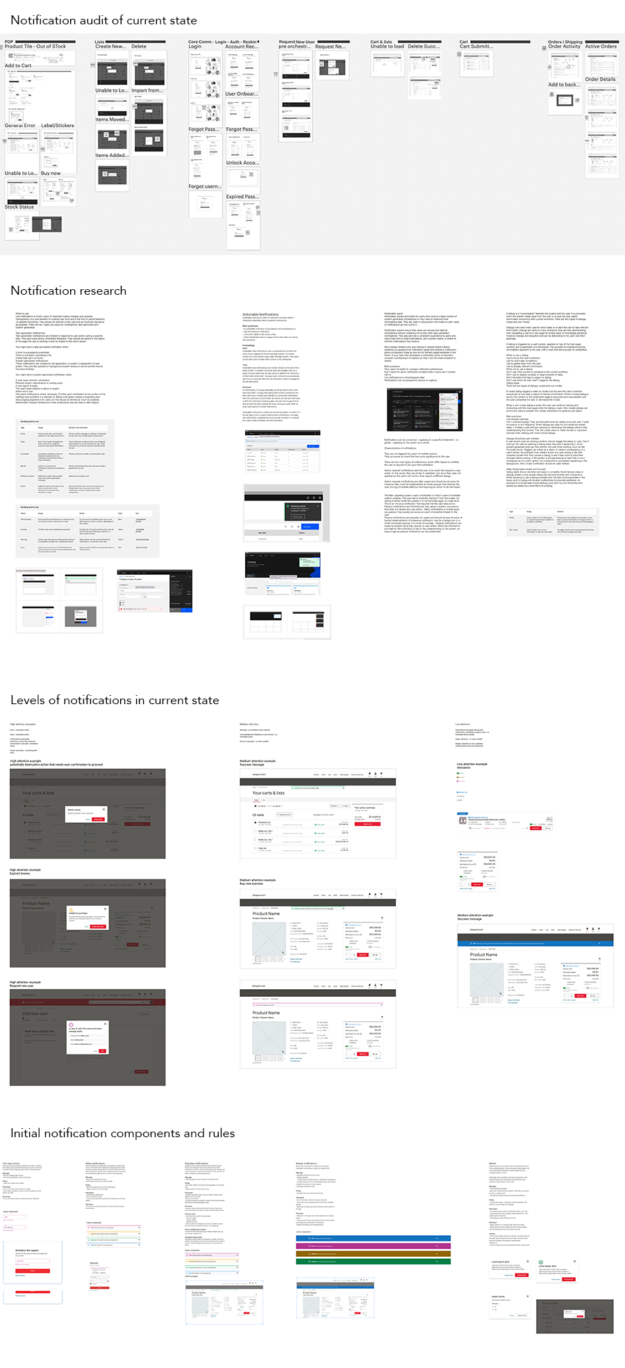
- Conduct an audit on current state inconsistent notification usage
- Research how other, more established, Design Systems document components and their rules
- Iterate on the creation of notification rules that align with the UX Teams overall vision for the product
Outcomes & Results
- Less confusion around the use of notifications for UX Designers
- Faster completion of projects
- Consistent user experience across the site
As the UX Team continues to work, new challenges arise. The Design System is a living, breathing thing. We continue to revisit the components and rules developed in order to ensure they continue to help us and not block us.